With so many posts flooding the LinkedIn feed every day, it’s crucial to make your content stand out. Strategical use of bold text in your LinkedIn posts is one way to do that. Let’s explore how you can enhance your posts with formatting techniques like bold, italic, and underlined text to capture attention and increase engagement.
How to bold text in LinkedIn posts and why formatting matters
How to bold text in LinkedIn post? Using text formatting—such as bold, italic, or underlined words—helps emphasize key points in your content, making it more readable and engaging. When you format certain words or phrases, they become focal points for readers, guiding their attention to the most important parts of your message.

How to bold text in LinkedIn posts: italics, underline and formatting tips
Bold, italic, and underlined text give structure to your posts. Bold textimmediately grabs attention, making important information stand out. Italic text can be used for emphasis or to introduce subtle distinctions or reflections. Underlined text highlights key takeaways or important links, drawing the reader’s eye to actionable content.
How to bold text in LinkedIn posts: best practices and mistakes to avoid
Enough is enough. Here’s when you should—and shouldn’t—use bold text in LinkedIn posts:
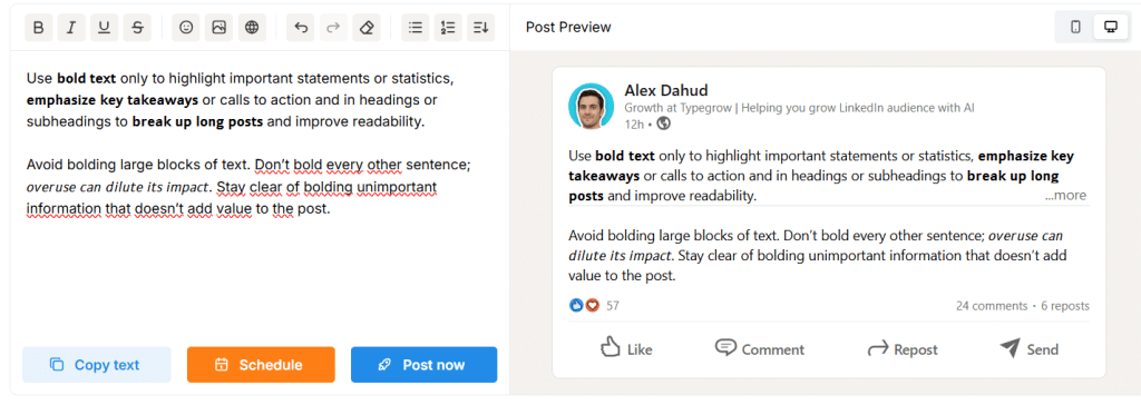
Use bold text only to highlight important statements or statistics, emphasize key takeaways or calls to action and in headings or subheadings to break up long posts and improve readability.
Avoid bolding large blocks of text. Don’t bold every other sentence; overuse can dilute its impact. Stay clear of bolding unimportant information that doesn’t add value to the post.
How to bold text in LinkedIn posts step by step
Unlike other platforms, LinkedIn does not offer native text formatting options like bold, italic, or underlined text within its post editor. However, there are ways to achieve these effects with a little extra effort.
Using third-party tools for text formatting
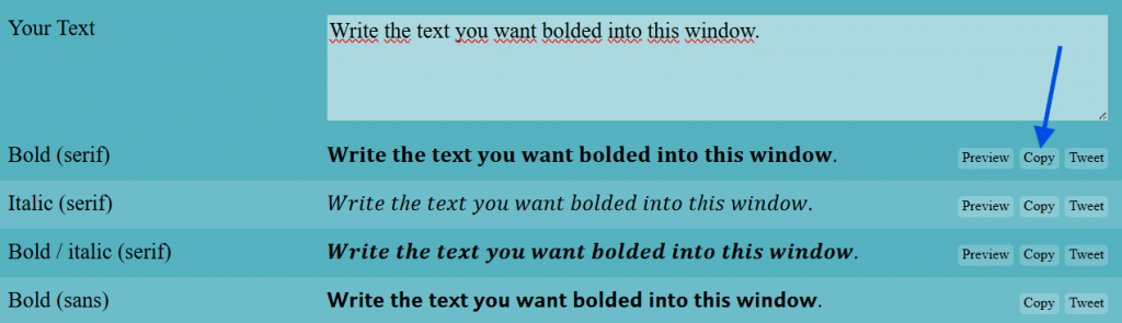
You can always simulate this by using a Unicode text generator, such as LinkedIn text formatter by YayText, to make your text appear bold or italic. It’s very easy, though it has its disadvantages. You simply enter your desired text into the generator, and it will produce a bold or italicized versions. You can then copy the formatted text and paste it into your LinkedIn post or profile. What are the downsides?
Firstly, screen readers can’t interpret these characters, making them inaccessible for visually impaired users. Additionally, this text won’t be indexed for search purposes, so using it for important keywords is not a good idea. Lastly, older Android devices may not display the characters correctly, showing rectangles instead.
The LinkedIn trick for bold and italic text
There is another option, too. And it is even easier than using Unicode! I’m talking about a very intuitive free online tool called LinkedIn Text Formatter. It’s incredibly easy to use and has many options of formatting (bold, italics, underline, bold italic, strikethrough, bold underline, bold strikethrough and script).
Best practices for formatting LinkedIn posts
It’s important to follow a couple good practices to ensure your content is visually appealing and easy to read.
Avoiding overuse of bold text in LinkedIn
As mentioned earlier, bold text should be used sparingly. If every sentence is bold, none of it will stand out. To maintain a balance. By focusing on what truly matters, your use of bold text will feel purposeful and impactful.
How to create visually appealing posts
In addition to text formatting, there are other ways to create visually appealing LinkedIn posts. Use white space (break up large blocks of text with paragraphs, line breaks, or bullet points to make your post more digestible), include images or graphics, use emojis (they add personality and emphasize tone; use them sparingly to maintain a professional look) and keep your post concise.
So, now you know how to bold words in LinkedIn posts! Go ahead and use your new skill, you will not be dissappointed!